

Clever Parents Brand Identity
I recently launched a new product (in partnership with Product Designer, Jemma Pearce) called Clever Parents, a messaging app that connects teachers and parents. Parents can chat with teachers, receive important information, and access special classroom moments.
This is a newer audience for Clever (as well as our first ‘native’ app), so creating a welcoming, friendly and accessible app, whilst still leveraging the trust of the core Clever brand, was important. Full identity design process took roughly 3 months (interspersed between other projects).
Currently available to download from the App Store and Google Play.
In the beginning…
There was a lot involved in this process! So here’s a very summarised run-down of this project (along with a visual snapshot) - if you want to know more, feel free to reach out! 📬
1) When it comes to any branding project, I always start with defining the brand values, as this is the foundation for building branding systems, and can be a useful way to measure success.

Snapshot of presentation I lead for establishing Clever Parents brand attributes
As Clever is an established brand, I had consider how it’s brand attributes would relate to Clever Parents. In addition, I posed to the stakeholders if there were any attributes missing from core clever that might be relevant to parents, how we’d rank said attributes, and paid close attention to how these were being described. This helped informed what the Clever Parent brand attributes, which were: welcoming, optimistic, reliable, smart

Woo! Welcome to the brand attributes for Clever Parents.
2) The next step was to see how we wanted to convey this brand – where did stakeholders see clever parents sitting on a spectrum of literal <-> abstract, playful <-> serious etc At this stage, I also presented options of how we might want to approach this (ie: through abstraction, continuation of clever branding), as well as listing out pros and cons of each direction. I format this meeting so that stakeholders can tell me what they see as the strengths and weakness of each illustration style/ concept - that way, I can see where I may combine strengths, work on deficits (aka: frankensteining illustration for something custom!)

Snapshot of concept directions
3) Using a welcome screen as the initial tester, I became roughly sketching out concepts based on the feedback from the mood boards. I also provide a spectrum of literal vs abstract.

Snapshot of initial sketches
4) During this time, the product designer and I realised we were missing an important voice in this conversation - the user! We decide to do a bunch of quick tests to see
1) if the brand illustration directions resonated with parents,
2) if our core brand attributes (welcoming, optimistic, reliable, smart) were evident and;
3) to test the actually product flow of the app
You may be thinking: how do you test brand attributes?
Well, for this, we went with a word rubric, and gave each user 5 stars to place. Whilst we weren’t expecting all 4 brand attributes to get called out, we were focusing on “welcoming” to show through. About 70% of the users picked that one.

We did about 3 rounds of testing - this was the second. You can see the word rubrics we used, on the right, to see if our brand values resonated in these concepts.
things we learnt from testing:
People really reasonated with the warmth of the yellow iteration, it felt welcoming.
There was a lot more clarity around what this product did with literal scenes
The illustrations, such as the mail and airplane, along with the blue dotted lines, made it clear that this was a messaging app between teachers and students. One user commented that she preferred having illustrated characters over real ones: when there’s real people it’s judged more frequently, “ie: why is she wearing this, why is she this race” Illustrated people reduces judgement bias.
Retaining the Clever logo was important for brand recognisability: “I trust this product because of the Clever logo”
On to designing
Armed with a whole lot of information, I felt ready to start tackling the visuals. I already had a gauge of what scenes would work best (which were based off the quick concepts I put together, the feedback from parents) and the stakeholders were in alignment with me. The first goal was to do a small batch of design for a beta release to about 200 people - and after we’d gather feedback, we’d do another round of changes.
I’m going to skip showing that process for the sake of brevity, and present you the final designs instead!
Drumroll please… 🥁
Introducing clever parents

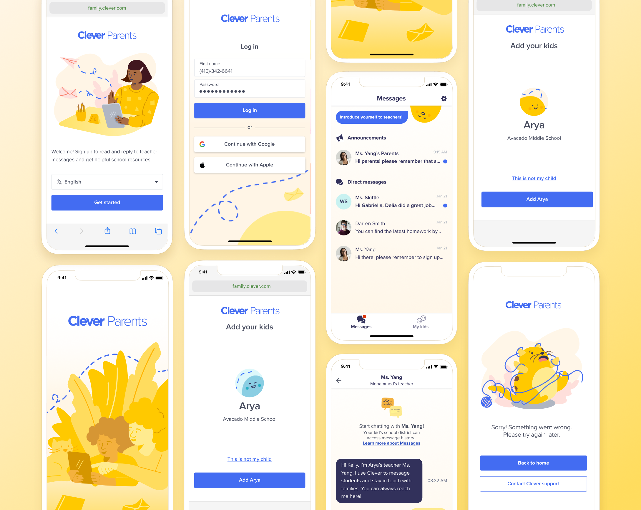
Initial app screens: splash screen, log in, inbox and messaging - I wanted to make sure that a blue line was included in all screens to keep a visual motif of connection and communication.

Scene illustrations: welcome, avatars and error screen. Throughout these scenes, I used objects you’d find at home, like pencils, plants and yarn 🧶to maintain that family feel.

Marketing touchpoints: invitation email, lifecycle campaign email, app store preview, playstore preview

App store screen preview - reiterating that blue connected line yet again

Branding guideline overview